- Previous message: Pawel Staszel: "Comparison between T2 and T3"
- Messages sorted by: [ date ] [ thread ] [ subject ] [ author ]
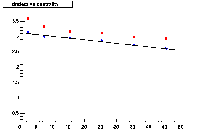
Hi, I have put together a figure that you will find attached with this
message.
The figure plots dndeta/(Npart/2) as function of the middle of the
centrality bin.
The red squares are the 200 GeV data at eta=0 and the blue stars
correspond to same set but at 130 GeV. This way of plotting the data is
an attempt to avoid using a non measured quantity in both axes. I think
a number intimately related to the centrality of the collision is good
because the volume of the system is the same, what changes is the
available energy for particle production.
I fit the 130 GeV points with a straight line and if I were to include
the error bars I could get a good representation of the 200 GeV data by
scaling up  the fit by ~8%
I think the trend we see in figure 5 of the paper is still there and
once again saturation is not something that jumps at you.
I would suggest we cut the discussion about fits to Npart and Ncoll
because after going thru that trouble, the next paragraph is asking the
reader to take the results with a grain of salt.

Ramiro

- Next message: Michael Murray: "Re: run status."
- Previous message: Pawel Staszel: "Comparison between T2 and T3"
- Messages sorted by: [ date ] [ thread ] [ subject ] [ author ]
This archive was generated by hypermail 2b30 : Fri Nov 16 2001 - 12:01:42 EST